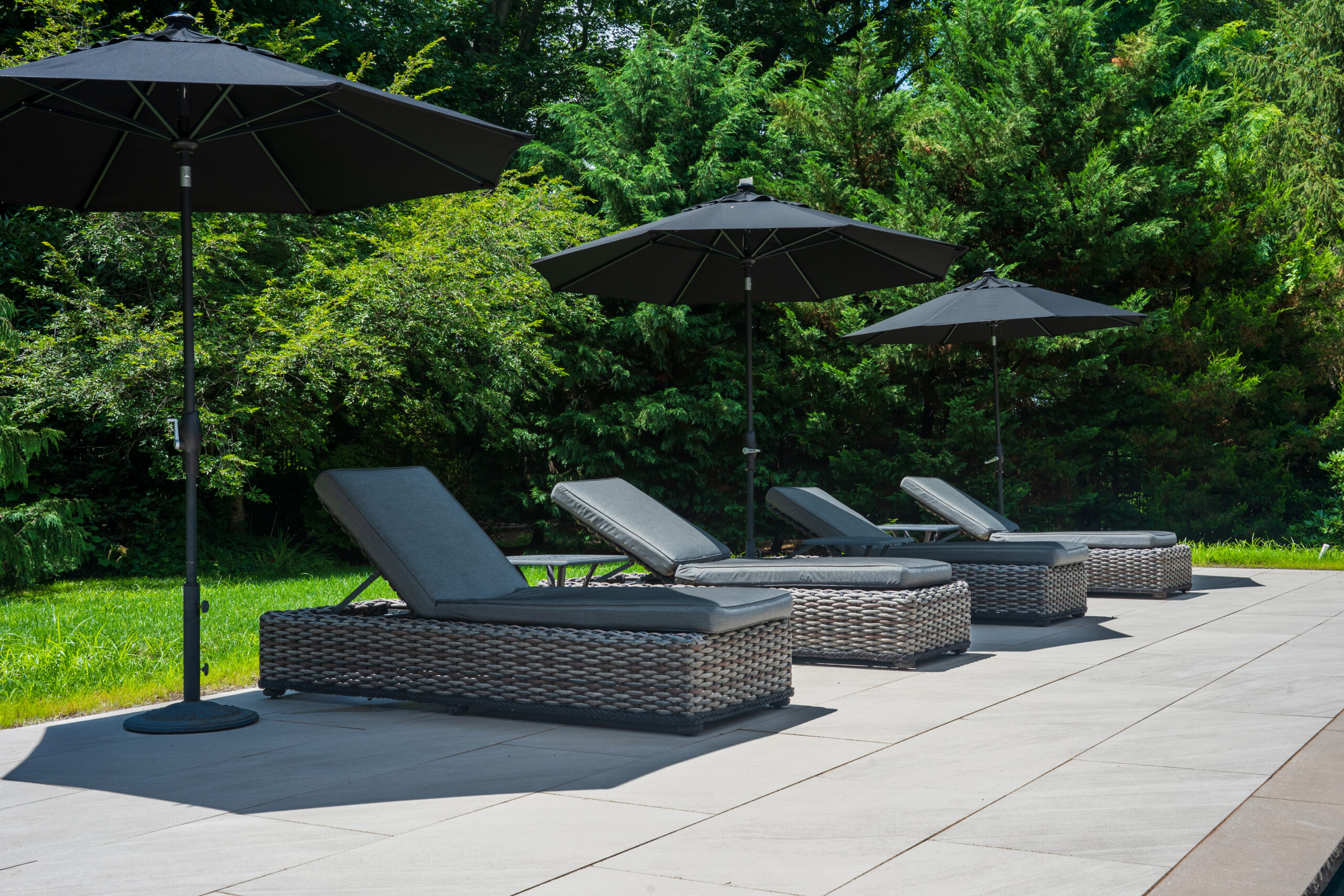
In waterscape design, the edge of the pool is rarely just a functional boundary. It’s a visual threshold- the moment where architecture, landscape, and water meet. And while coping thickness, profile, and materials selection receive much attention, color strategy often determines hows the entire pool composition is perceived.
One of the most important design decisions an architect or landscape designer needs to make is whether the coping should stand apart from the surrounding deck or blend seamlessly into it. Both approaches can produce exceptional results when applied thoughtfully. The key is understanding when contrast clarifies the design and when continuity allows the space to feel calm, refined, and unified.
When Contrast Creates Definition
There are moments in design when the pool can benefit from a clear visual frame. A contrasting coping color can establish the pool as a deliberate architectural element rather than a simple recessed plane within the patio.
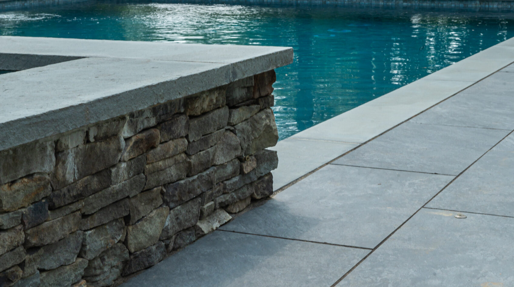
This strategy works particularly well when the goal is to outline the water’s edge. Darker coping against a lighter patio surface can create a subtle border that enhances the perceived clarity of the poo’s geometry, where the eye naturally reads the coping as a frame, giving the water a crisp, graphic presence within the landscape.
Contrast can be especially effective in:
- Large or estate-scale pools, where definition prevents the deck and water from visually merging.
- Pools with complex shapes, where contrast clarifies curves and angles.
- Projects where the surrounding patio is expansive, and the pool requires visual grounding.
Bluestone coping paired with lighter-toned limestone or porcelain decking, for example, introduces depth without feeling ornamental. The darker edge becomes an architectural line that draws attention to the water while respecting the broader material palette.
Contrast, when used well, is not loud, but it ensures the pool maintains a clear visual identity within the landscape’s composition.
When Continuity Creates Sophistication
While contrast offers clarity, continuity often delivers elegance.
Blending coping seamlessly into the surrounding patio material creates a monolithic surface where the pool feels integrated rather than framed. This approach has become increasingly popular in contemporary landscape architecture, where the goal is often to reduce visual noise and allow water, light, and space to take center stage.
When coping and decking share the same material or tonal family, the pool edge becomes almost invisible. The water appears to emerge naturally from the patio plane, producing a calm and understated effect.
Continuity tends to work best when:
- The design language favors minimalism and restraint.
- The patio material itself is visually rich, making additional contrast unnecessary.
- The pool is relatively small and benefits from a sense of openness.
- The surrounding architecture favors clean, uninterrupted surfaces.
In these cases, using the same stone or paver across the deck and coping allows the pool to feel like a natural extension of the landscape rather than a separate component.
Considering Light, Water, and Environment
Coping colors does more than influence the hardscape composition. It also interacts with light and water, shaping how the pool feels throughout the day.
Darks coping can intensify reflections along the waterline, adding depth and contrast when sunlight strikes the surface. Lighter coping, by comparison, softens the transition between water and deck, often creating a brighter and more relaxed atmosphere.
Regional climate should also be considered as well. In warmer environments, lighter-toned materials may remain cooler underfoot. In northern climates, however, slightly darker stones can sometimes mask minor seasonal variations in moisture or mineral deposits.
Ultimately, coping color should respond not only to the patio material but also to the broader environmental conditions and architectural context of the site.
The Value of Mockups and Material Samples
Even experienced designers benefit from evaluating coping color decisions in physical form. Stone and pavers can shift noticeably under natural light, and subtle variations may appear drastically different when placed adjacent to water.
Whenever possible, reviewing sample boards or smalls mockups alongside the chosen patio materials provide alignment before final specification. Seeing materials together, particularly under the conditions in which they will live, often reveals relationships that renderings alone cannot convey.
These small steps can prevent costly revisions and ensure the coping strategy reinforces the design intent.
Designing the Pool Coping Edge with Intention
Although at first glance, coping color may appear to be a minor aesthetic decision, in reality, it shapes how the entire pool is perceived. Whether the water reads as a framed feature or as a seamless extension of the surrounding hardscape is significantly influenced by your coping choices.
Neither approach is inherently superior though. The most successful projects simply choose the strategy that aligns with the architecture, materials, and atmosphere the space is meant to create.
Quality design deserves quality materials. Partner with Braen Supply to source reliable stone, veneer, and pavers tailored to your project requirements.
About the Author
Written in the voice of Braen Supply’s in-house expert persona, Gabriel Shaw. Shaw embodies the collective knowledge of our team and shares practical, straightforward tips to help landscape professionals make the most of their landscaping and masonry projects – drawing on decades of experiences serving New Jersey and the tri-state area.