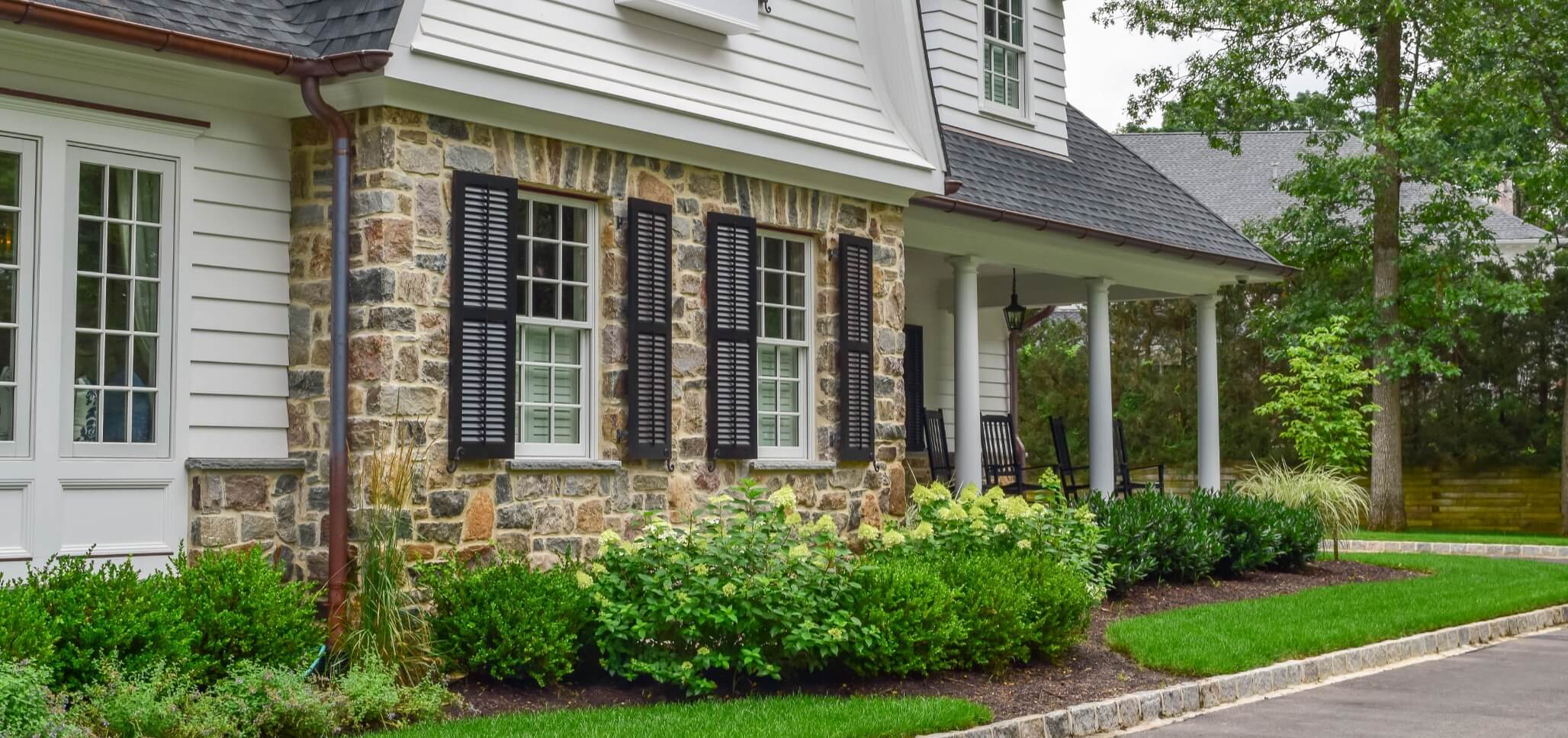
Today’s most successful designs recognize that outdoor living is not an addition, but an extension. It is an architectural narrative that begins indoors and flows out into nature. For design professionals, the single material that best supports this continuity is porcelain.
Porcelain offers unmatched versatility when blending interiors with exteriors. Achieving true harmony, however, requires more than choosing matching colors. It’s about scale, surface, transitions, and above all, designing with intention.
1. Surface Texture and Slip Resistance
Indoors, a matte or polished finish may be suitable, but outdoor installations demand a surface that prioritizes safety. Fortunately, many premium porcelain lines now offer coordinated finishes: this gives the same visual aesthetic with an R11-rated outdoor grip and a smoother R9 or R10 interior finish. This duality allows designers to maintain visual cohesion while respecting function.
Design tip: Always verify slip-resistance ratings for exterior applications, particularly in climates with frequent rain, pool areas, or freeze-thaw cycles. Visual continuity should never come at the expense of user safety.
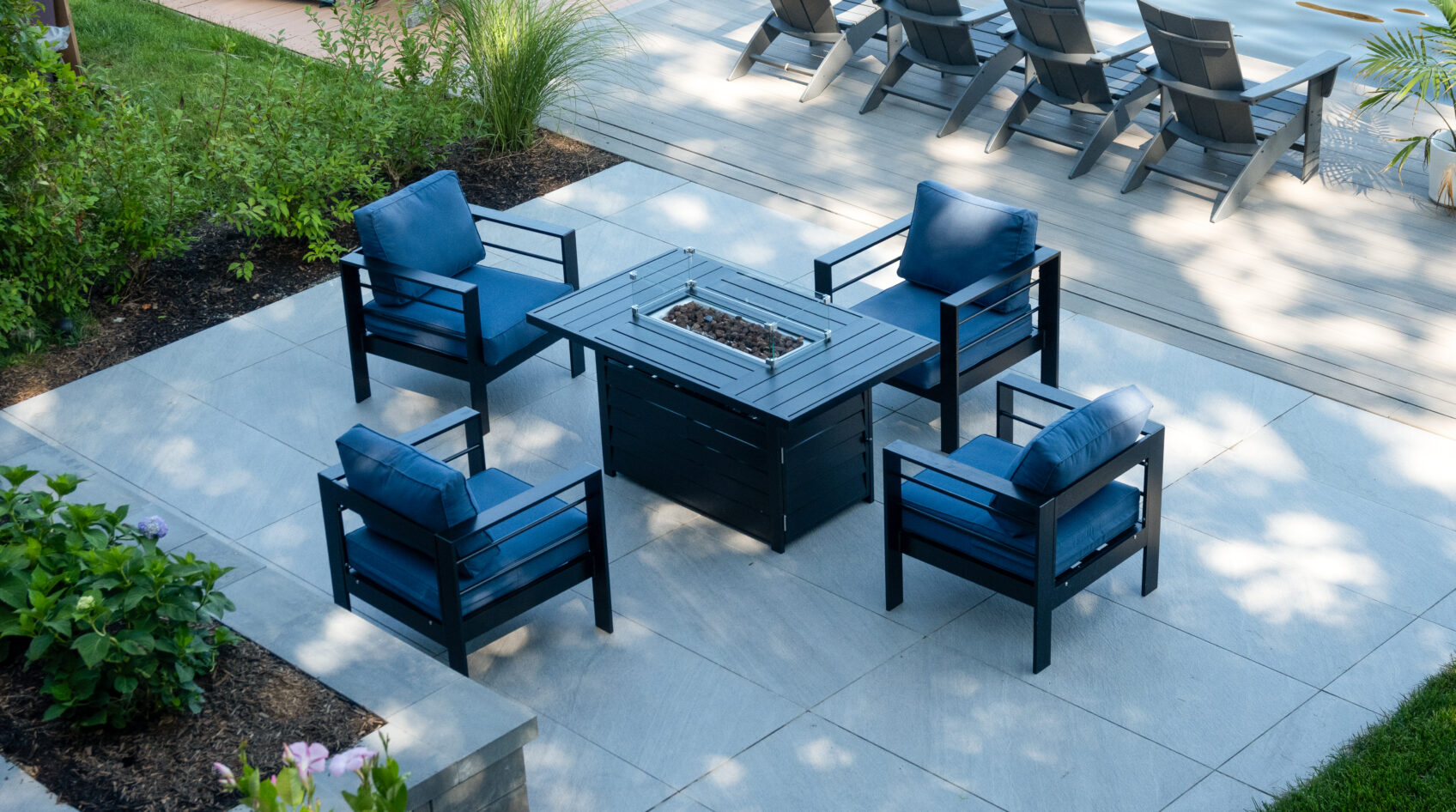
2. Matching Formats and Modular Planning
One of the most overlooked aspects of continuity is scale. An interior kitchen floor with 12×24 tiles juxtaposed against a 24×24 outdoor mosaic patio feels disjointed, no matter how well the tones match. Instead, look for collections that offer multiple formats across both indoor and outdoor versions.
Modular sets (such as 24×24, 12×24, and 24×36 in the same collection) enables a precise layout. This becomes particularly elegant in threshold zones like sliding glass walls or covered verandas, where the eye expects alignment.
3. Transition Zones and Threshold Details
The visual bridge between indoor and outdoor porcelain is the threshold. Flush transitions are ideal, not just aesthetically, but for aging-in-place and ADA compliance. When elevation changes, which are unavoidable, integrate shadow lines, contrasting grout, or linear drains to mark the shift without disrupting flow.
Many miss the opportunity to frame thresholds as focal points. Consider inlay patterns or a shift in laying angle as subtle cues to transition without jarring the visual rhythm.
4. Color Tone and Light Reflection
Even the best porcelain can shift appearance under different lighting conditions. The color that reads warm and cozy under soft sunlight may appear cool and stark under indoor LEDs. When selecting tones, assess samples under both lighting conditions. If a cohesive palette is essential, consider neutral mid-tones, which tend to hold consistency across environments.
Porcelain with a lightly textured or honed surface will also mitigate glare in outdoor use, contributing to visual comfort and a more organic experience.
Design with Purpose, Not Parallels
Blending indoor and outdoor porcelain is not simply about matching tiles; it’s about creating a dialogue between spaces. We must treat each area not as a separate chapter but as an element of a singular story. Porcelain gives us the means to do just that: unify experiences, elevate everyday rituals, and transform thresholds into transitions.
Let us remember that in fine design, true luxury lies not in opulence but in cohesion.